Help Select The Design Direction: Ephesians
Last week we chose the title of our first series, Ephesians: Walk the Walk.
This week, we need to choose a direction for the art design.
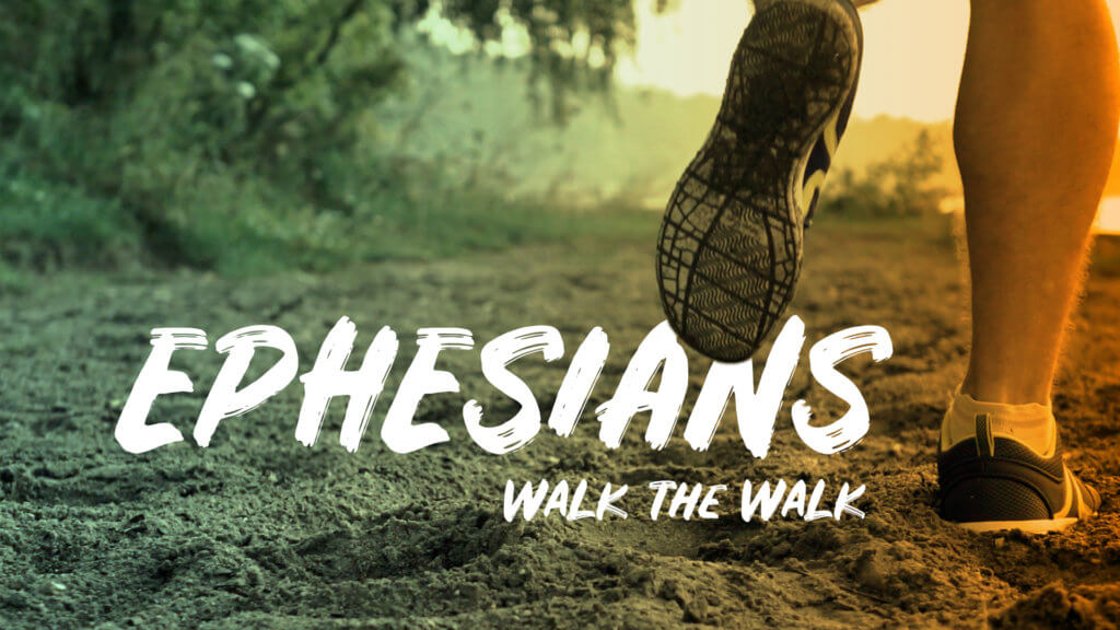
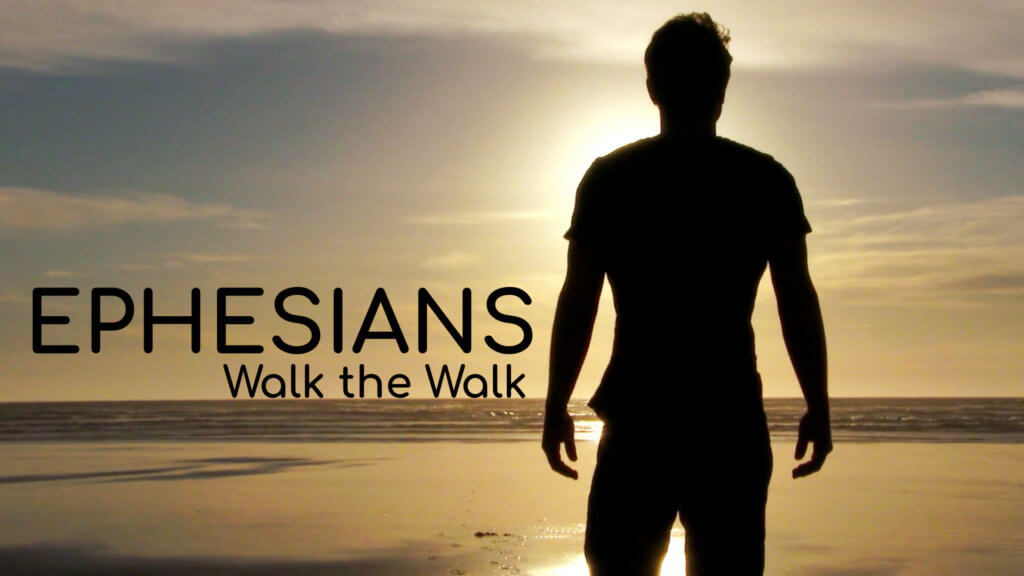
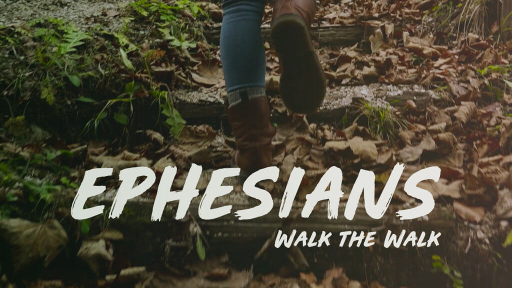
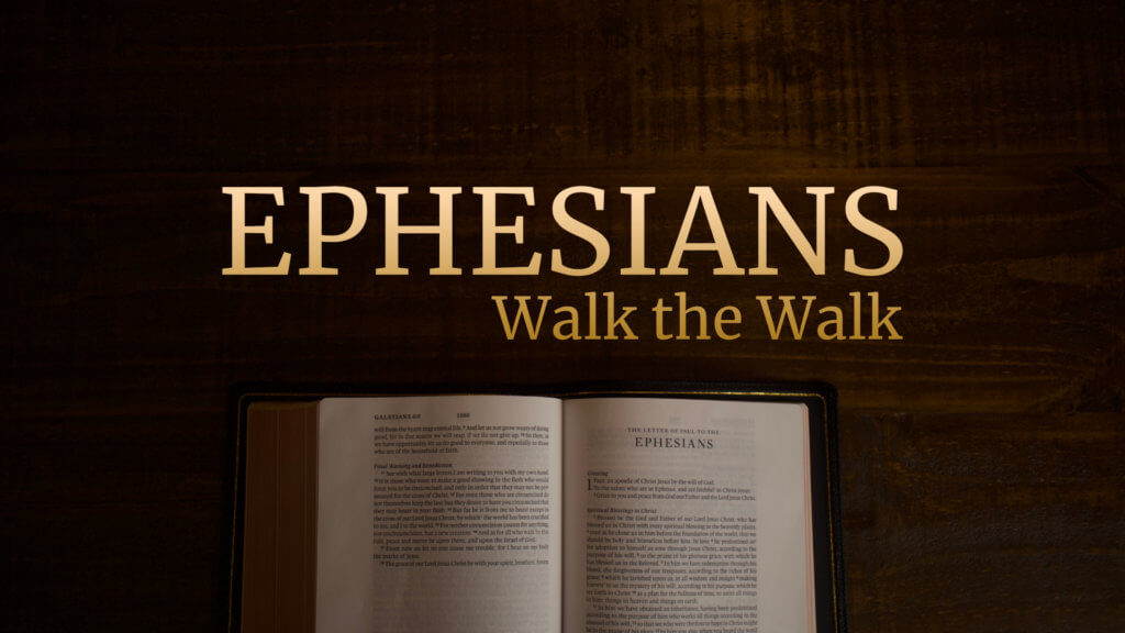
So here are four different concepts that we’ve put together.
These are not final pieces (we can still make improvements), but we need to pick our favorite direction to go with.
Look at the four designs below, and then vote for your favorite.
Voting will be open until Wednesday at midnight (MST).
1. Shoes on Sand

2. Man on Beach

3. Boots in Woods

4. Bible on Wood

Vote for your favorite
As mentioned earlier, none of these design concepts are finalized, so please share any critical feedback in the comments below (Good? Bad? What could be better?).
What would you change?
Your input is extremely important. We are better when we work together.

new member when does the next step start? thanks
Hey Tim, welcome! Glad to have you, brother.
Tomorrow, I’ll be putting up another post on the final step in this series. Then, we will start the process over again in December to work on our next series.
Until then, feel free to look over the archive of posts here to see what we’ve already decided.
Hope that helps.
It might make sense to have some choices of ethnic pictures that would appeal more to multi-ethnic church congregations.
Good point. We definitely don’t want our designs to feel like they aren’t inclusive of everyone.
Suggestions on the six “walk” messages:
Week 1 – Walk in Confidence
Week 2 – Walk in Peace
Week 3 – Walk in Understanding
Week 4 – Walk in Community
Week 5 – Walk in Love
Week 6 – Walk in Victory
I like these, David. We voted on the order last week, otherwise, I would absolutely put this up for consideration to everyone. However, there might be a way to work some of this in. I’m curious, what passages of Ephesians do you have in mind for each?
Each week would cover a chapter.
Week 1 – Ephesians 1
Week 2 – Ephesians 2
Week 3 – Ephesians 3
Week 4 – Ephesians 4
Week 5 – Ephesians 5
Week 6 – Ephesians 6
How about people walking 🚶🏻 up and down a busy sidewalk or downtown store 🏬 shops?
That’s a great suggestion. Although it’s not in these four design concepts, I’ve been looking at some early development on the bumper video and it includes some city scenes like these.
I voted 1 but it was a coin toss between number 1 and number 3.
Thanks for the feedback. What drew you to those two over the others?
I think they look great. I just thought I suggest that in the pictures were people are walking maybe we could use a picture of both a man and a woman.
Thanks
Pastor John
Thanks, John. That’s a good suggestion.